I’m Jess, an experienced UX/UI designer based in the Midwest. Think we should chat? Reach out at [email protected].
© Copyright 2025 Jessica Kennon Spencer

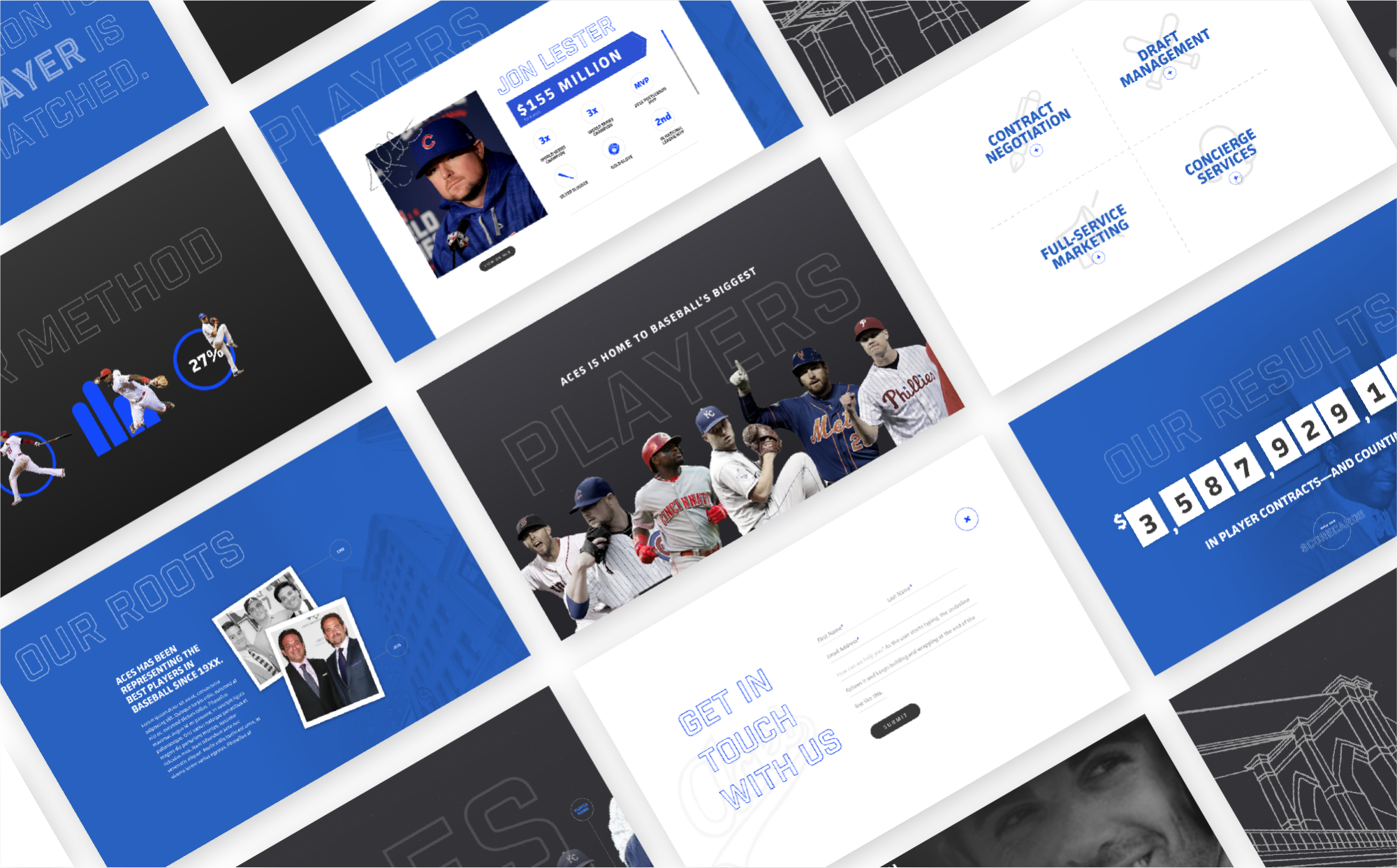
Forbes-ranked Aces represents some of the biggest names in professional baseball, serving dozens of world champions, MVPs, All-Stars, Gold-Glovers, Silver Sluggers, and Rookies of the Year. Aces’ impressive roster is only growing as the agency courts up-and-coming talent from all over the country—and the company needed a polished, boutique web presence to show potential recruits the level of quality they could expect from Aces.
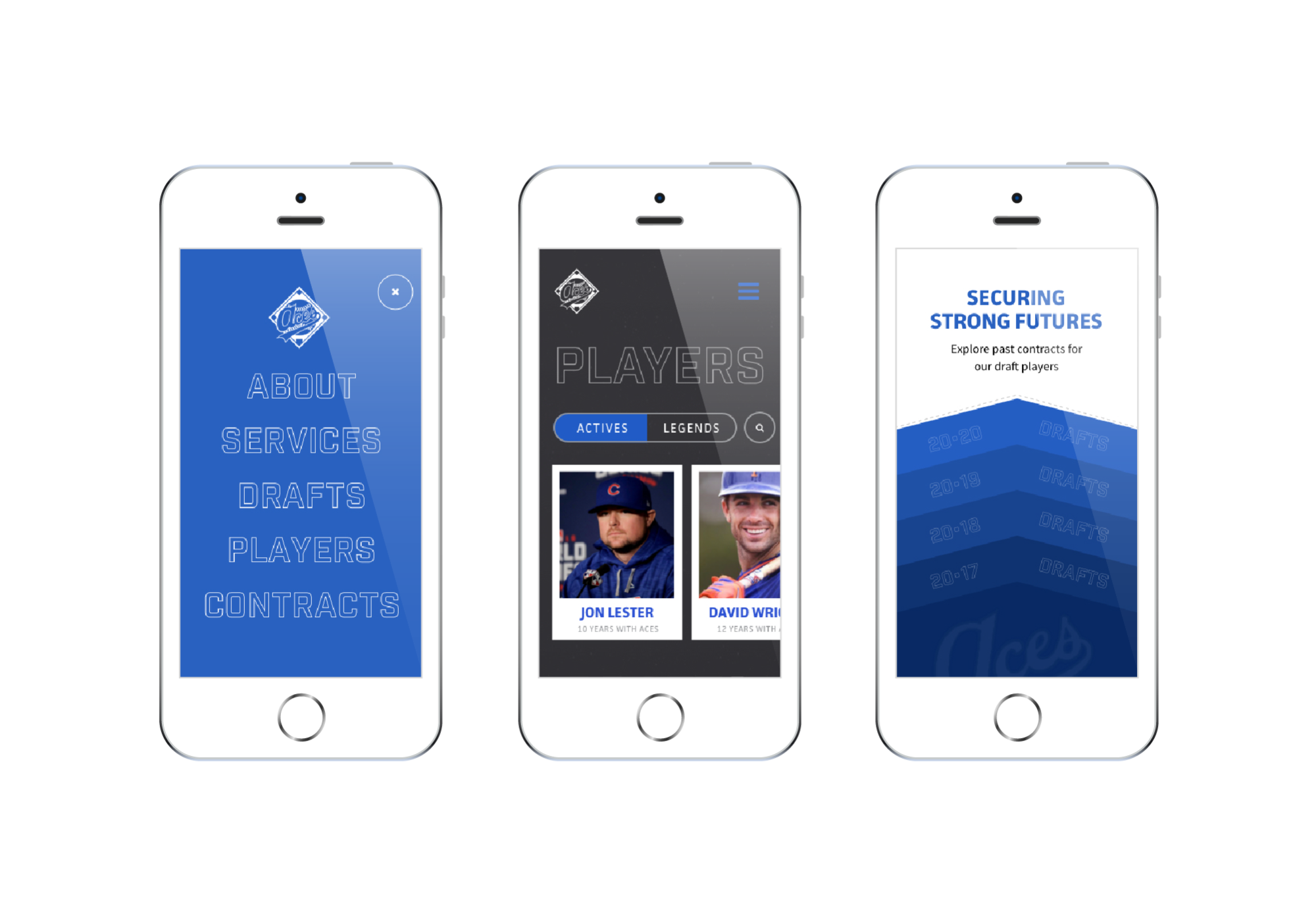
An elevated, modern interface would appeal to a younger user base and help Aces put its best foot forward in new relationships—and behind-the-scenes content and privacy features allowed the company to control private content, information, and tools of their trade, keeping proprietary info out of the hands of competing agencies.


Each primary page is topped with a horizontal scrolling animation that introduces the focus of the page and immediately engages the user in the content experience. I created supporting custom line llustrations for several pages, while on others relying on existing assets of recognizable players on the Aces roster. The resulting animations created an ownable, distinct experience custom to Aces, and delivered a nontraditional experience with stopping power.

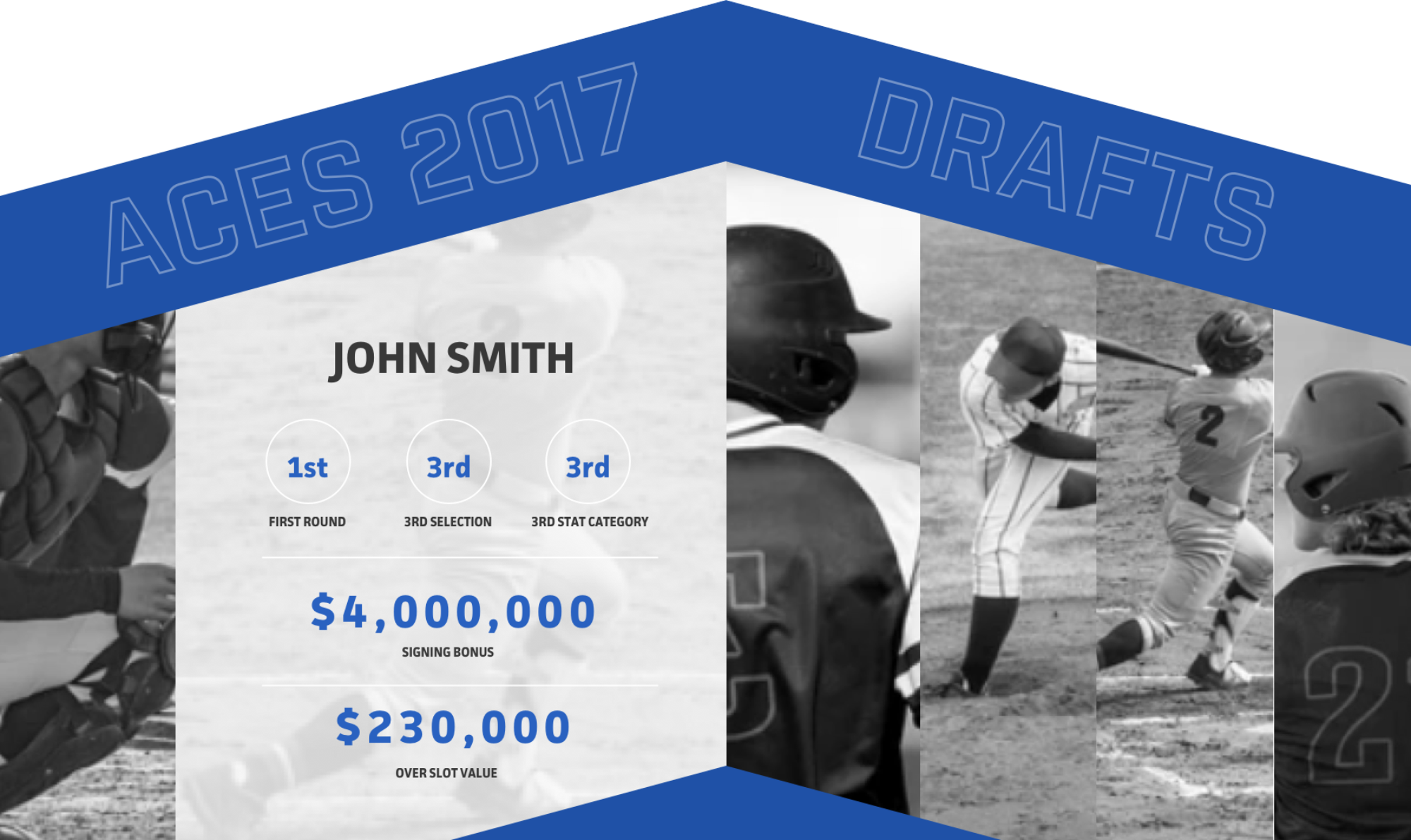
Some of the most compelling stories for potential draft recruits are case studies of previous contracts secured by the Aces team. To feature insights in a unique and at-a-glance way, I designed expandable accordion sections that featured “yearbooks” of previous drafts, containing interactive hover states that reveal at-a-glance statistics for featured draft players. This allowed users to browse multiple player content without navigating to child pages.

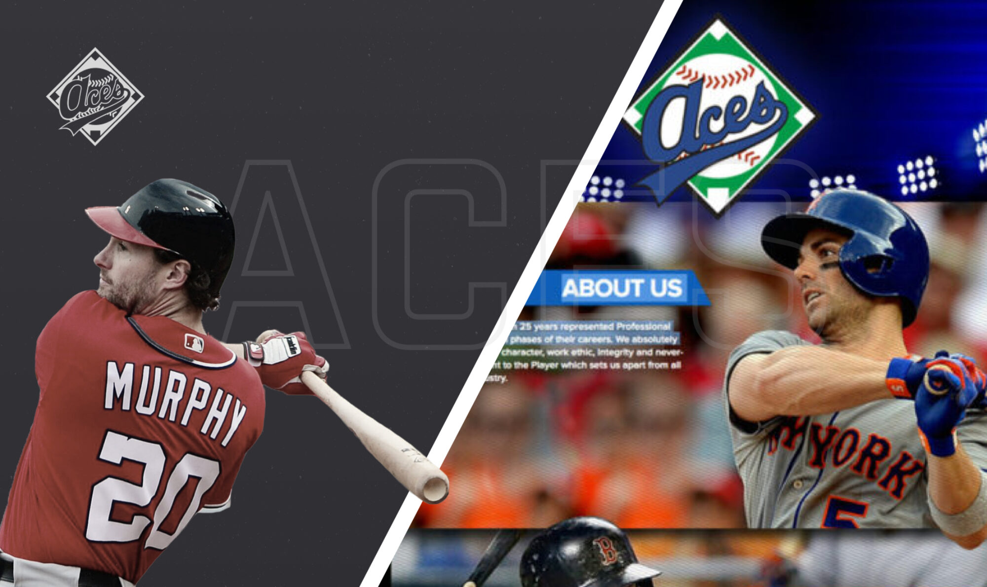
Ultimately the Aces site resulted in a modern, elevated site with a polished, boutique look that sets the agency apart from its corporate competitors. The UI features new patterns that don’t rely on tired sports cliches and imagery and allowed the agency to build on newly established design patterns to inform its brand evolution.
After sinking so much effort into this project, our team was grateful for the nods of recognition that the site received from peers. The site received an Honorable Mention from Awwwards, a Gold Addy in the Consumer Website category, and a surprise Judges Award Addy for Overall Design.