I’m Jess, an experienced UX/UI designer based in the Midwest. Think we should chat? Reach out at [email protected].
© Copyright 2025 Jessica Kennon Spencer

As a regional community health organization, Burrell provides some of the most critical care to individuals and families in Missouri and Arkansas. An innovating organization, Burrell’s new leadership team had secured CCBHC status and funding, and was leaning in hard on infusing the organization with new energy, progressive practices and care models, and was looking to shake things up in all the right ways.
The organization’s website, logo, signage—all of the most public-facing aspects were dated, tired, and somber. Burrell’s leadership team looked to Mostly Serious to lead a research-driven rebrand and custom website to help redefine the brand, lead conversations around mental health, and guide their outreach efforts for those seeking the most critical care.
The resulting work would usher in a new era for Burrell, and position its communications team to be ready to respond to a year that would bring unprecedented challenges and opportunities wrought by COVID-19's immeasurable impact on community health.

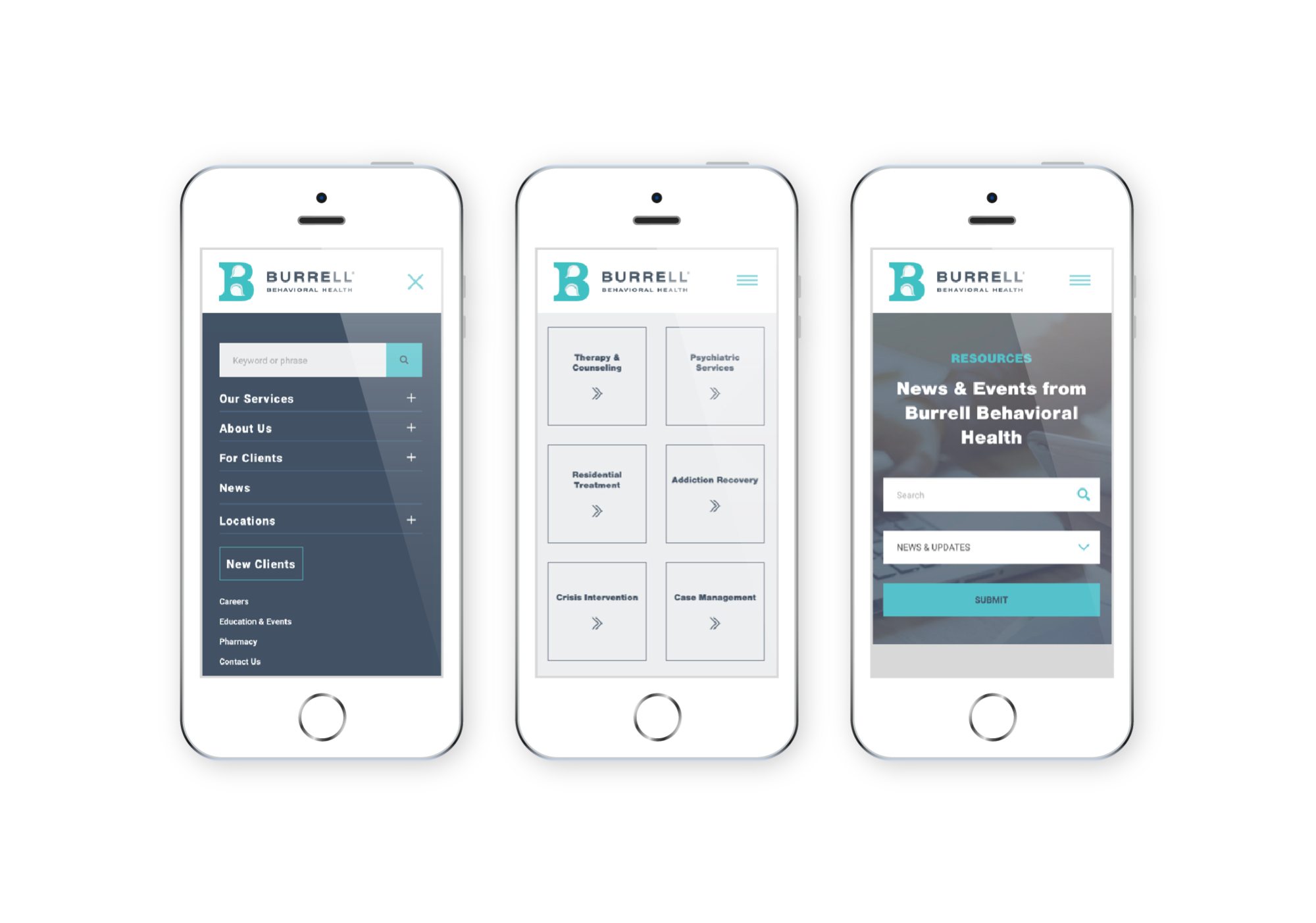
Burrell's homepage design establishes the site's navigational structure, in primary and secondary menus, and sets many of the content patterns and modules visible throughout interior pages. A video header with knockout headline leads the hero area, and following content sections lead users to high priority destinations, connecting them with the services they seek.

Burrell's About page design introduces and defines the organization and helps to establish its credibility as an expert care provider. Secondarily, organizational information, including mission, vision, and value statements are incorporated, and the page automatically populates blog posts categorized as News and Updates.

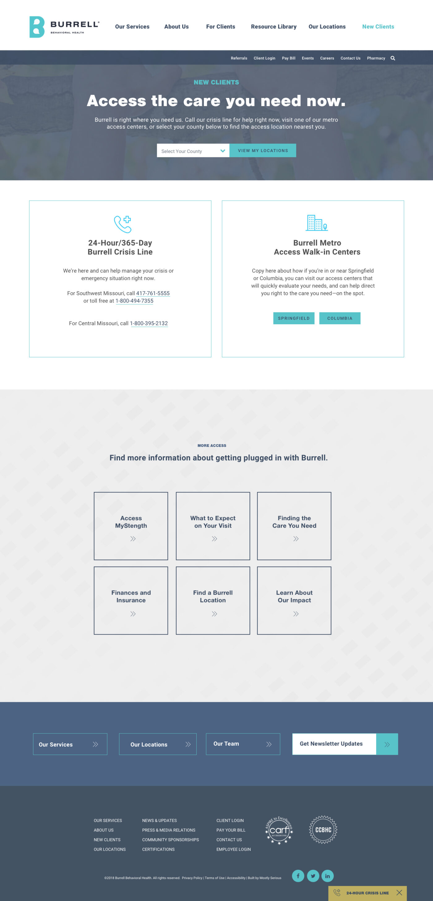
Burrell's Access Page is the destination URL for many calls to action throughout the site. In real life, Burrell has centers that route all new patients through assessment, referral, and into their corresponding service providers, all within a rapid time frame. The global call to action, visible from every page of the site could mimic that function by allowing users to connect with those access centers through the website. Location logic was set up with the access center results initially to allow the organization to add additional Access locations as they intended to expanded coverage over time.

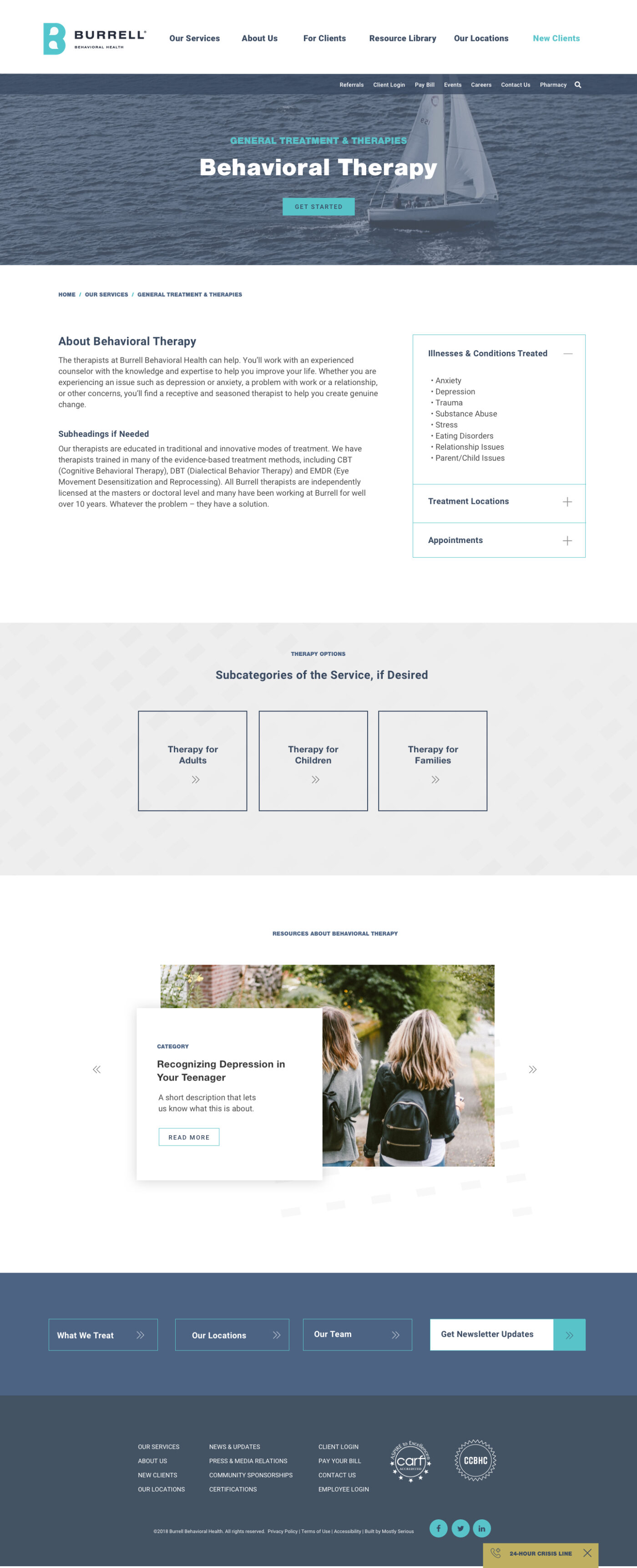
The Burrell organization has wide-ranging services and treatment options that each span across several internal departments, each with different locations, management, and stakeholders. I created a flexible service page structure that would allow content to be built out in ways best suited for these unique instances, and providing content patterns that would help unify the way different departments talked about their services. Options for related sub-services (and corresponding child pages), illnesses and conditions, and locations were provided. Departments could also choose to "build out" content even further by adding related articles or modular content. Most importantly, pages offered built-in calls to action, or "on-ramps" to accessing treatment.


Burrell's website project wasn't just a redesign—it was also the north star for the organization's new brand and repositioning as a leading provider of integrated care. Burrell's mission to reframe the conversation around mental health, breaking the associated stigma that prevents patients from engaging care came to live in the brand positioning exercises, the new logo and brand guidelines, the website's visual design components, and content strategy.

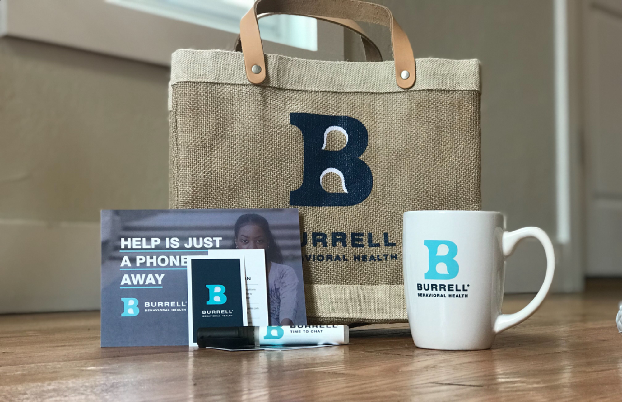
Supporting the launch of a new brand, meant more agency support than just website and logo design. Design support for the new brand also extended to letterhead and business cards, appointment cards, signage updates, and more patient touchpoint throughout the extensive organization.